
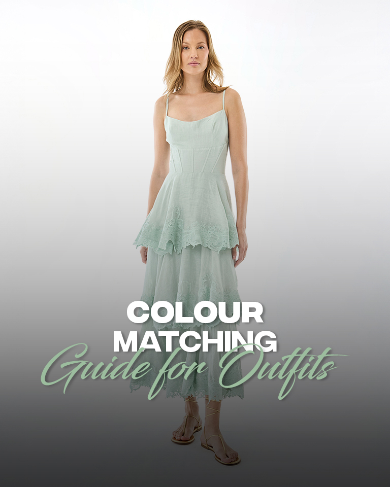
Mastering the art of pairing colours can instantly elevate your style and make your outfits look effortlessly polished. Whether you prefer classic neutrals, bold statement shades, or trendy colour combinations, understanding how different hues work together can help you create stylish looks for every occasion.
This extensive colour matching guide will help you explore the basics of colour coordination, discover flattering combinations, and learn how to mix and match shades like a pro. With a few simple tips, you can build versatile outfits that reflect your personal style and make getting dressed easier every day.
What Is Colour Theory in Fashion?
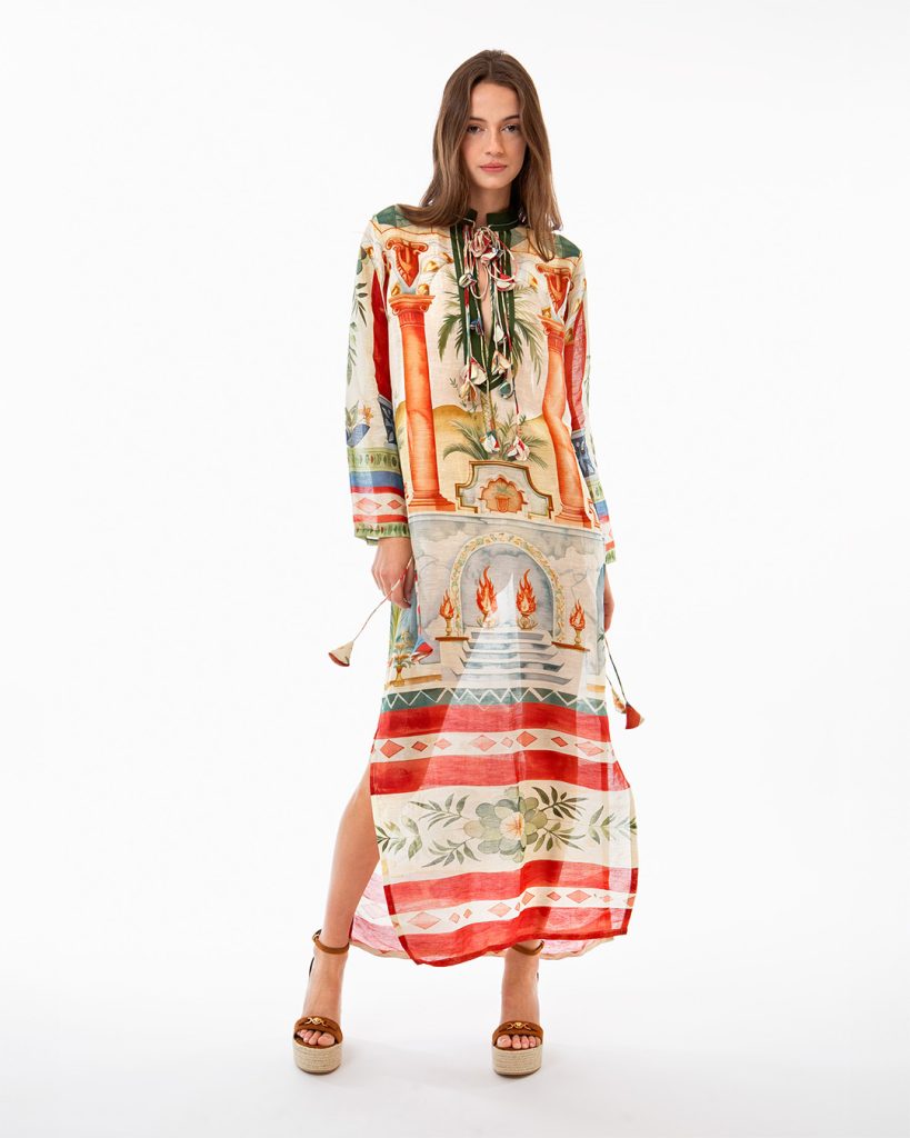
In fashion, colour theory states how colours work together and how they influence the appearance, mood, and overall impact of an outfit. The knowledge of colour theory is crucial in selecting, coordinating, and combining colours to create balanced and visually appealing looks.
There are several complex concepts such as primary, secondary, and tertiary colours, complementary and analogous colour combinations, seasonal colour palettes, and warm and cool tones to choose from. Colour theory is integral for fashion designers and stylists for conceptualising new collections, expressing emotions, communicating personal style, and keeping up with trends.
Understanding the Colour Wheel for Fashion
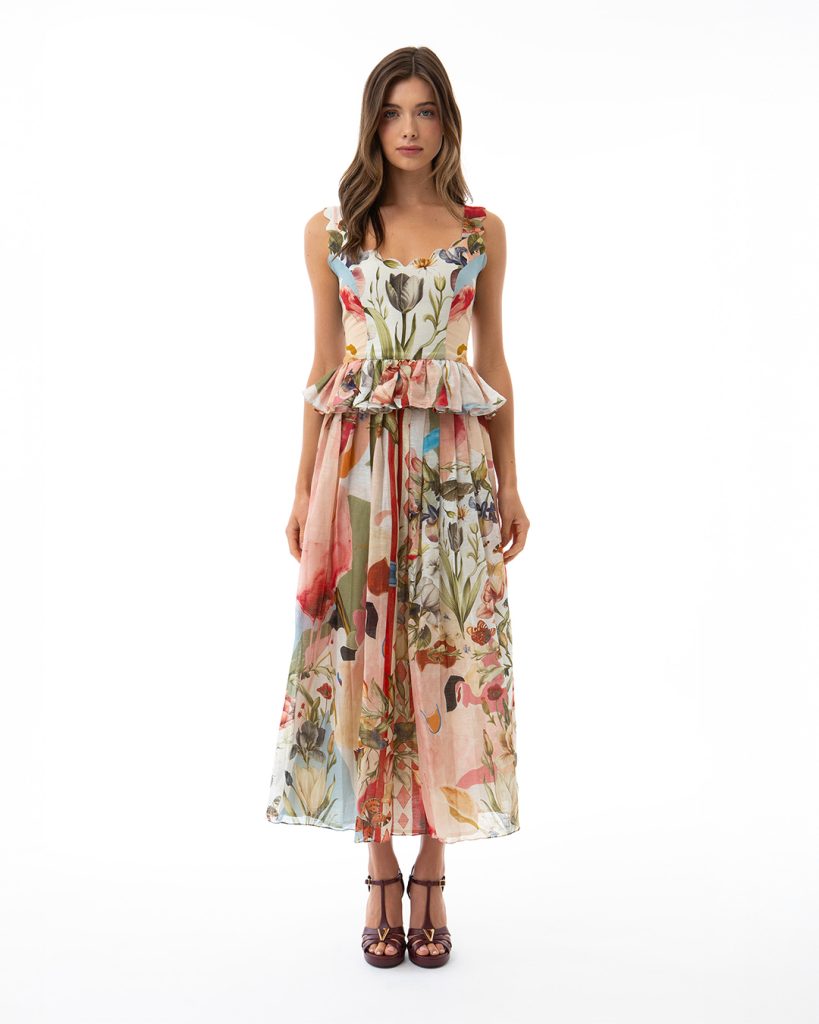
The colour wheel is a visual guide that shows how colours relate to one another and how they can be combined to create visually appealing outfit combinations. It showcases primary colours (red, blue, and yellow), secondary colours (orange, green, and purple), and tertiary colours, which are formed by mixing primary and secondary colours. When designing or even styling, the understanding of the colour wheel helps coordinate different elements of an ensemble like clothes, jackets, shoes, and accessories to create a balanced and cohesive look.
Complementary, Analogous, and Triadic Colour Schemes
The three colour schemes provide visual systems on the colour wheel that help designers and stylists to create harmonious colour combinations.
Complementary colour schemes:
Pairs two colours that sit directly opposite to each other on the colour wheel, like red and green, yellow and purple, or blue and orange. The combination creates maximum visual interest due to high contrast.
Analogous colour scheme
This colour scheme combines 2-4 colours that sit right next to each other on the colour wheel, such as yellow, yellow-green, and green or blue-violet, blue, and blue-green. This combination creates a soothing and calm visual effect as the hues share similar undertones, creating low visual tension.
Triadic colour schemes:
This particular colour scheme features three colours sitting at 120 degrees apart on a 12-part colour wheel. This combination can feature a set of primary, secondary, and tertiary colours, creating a playful and vibrant look that is balanced.
The 60-30-10 Rule
The 60-30-10 rule is a styling principle used to create a balanced colour combination for an outfit. It suggests using 60% of a dominant colour, 30% of a secondary colour, and 10% of an accent colour. The dominant colour usually forms the base of the outfit, such as a dress, suit, or trousers; the secondary colour adds variety through items such as jackets, shirts, or skirts; and the accent colour introduces a striking detail through accessories, shoes, bags, or jewellery.
How do you determine colours for every season?
There are three core traits that you need to evaluate to determine your seasonal colour palette, i.e., your skin undertone, hair colour, and eye colour. Here is how to determine your season and the suitable colours for you.
Winter: If you have a cool or neutral-cool skin undertone, or silver, platinum, or white gold look more flattering on you, then your season is winter. Opt for crisp, bold colours and strong contrasts for a striking look. For you, suitable colours would be black, pure white, cobalt blue, emerald green, ruby red, magenta, and icy pink.
Spring: If yellow gold and rose gold jewellery sit well on your skin, then you have a warm or neutral-warm undertone. Opt for fresh, bright colours to make your face look lively and radiant. Best colour options for the spring season would be coral peach, warm pink, ivory, mint, butter yellow, light turquoise, and aqua.
Summer: Summer season in colour analysis is associated with cool, soft, and muted tones. Cool or neutral-cool undertones pair best with silver or muted rose gold jewellery, and soft, blended colours complement you better than bright shades. Therefore, the best colours for you would be powder blue, dusty rose, mauve, lavender, soft grey, sage, and muted berry.
Autumn: If your skin tone looks radiant against gold, bronze, and copper, then you have a warm or neutral undertone. Rich, earthy colours make your complexion look radiant and healthy. Best colour choices for the autumn season would be terracotta, rust, olive, mustard, camel, forest green, brown, chocolate brown, and burgundy.
Colour Matching Quick Reference
| Base colour | Best complementary colours | Accent shades | Overall look |
| Black | White, grey, camel, denim blue | Ruby red, fuchsia, emerald, cobalt blue | Bold, elegant |
| White | Navy, beige, olive, light blue | Coral, red, turquoise, lemon yellow | Fresh, clean |
| Beige | White, chocolate brown, navy, olive | Rust, terracotta, teal, burgundy | Warm, sophisticated |
| Navy | White, beige, grey, light blue | Mustard, coral, red, emerald | Classic, polished |
| Olive | Cream, beige, black, denim blue | Rust, burnt orange, burgundy, mustard | Earthy, rich |
Common Colour Matching Mistakes to Avoid
There are some common colour matching mistakes that can ruin your look and make a faux pas out of your fashion wardrobe. But here are some expert recommendations to keep your outfits in check.
- Ignoring skin undertones: Wearing colours that clash with your skin’s undertone can wash you out or make you look tired.
- Overcrowding with too many colours: Wearing multiple bright colours creates visual clutter. It is recommended to stick to 3 to 5 colours, or go with the 60-30-10 rule.
- Pairing conflicting neutrals: Combining dark neutrals without adding a lighter hue to break the monotony can make the outfit look heavy or visually blocked.
- Too many matching elements: A cohesive look is not about matching all the elements of your look. The key is to utilise different tints, shades, and tones to keep the colour intensity enjoyable.
Frequently Asked Questions
What is the 3-colour rule in fashion?
The 3-colour fashion rule limits the use of a maximum of three colours to create a refined and visually balanced look and to avoid clutter.
How do I know what colours suit me?
Determine your skin’s undertone, your overall contrast, i.e., your hair and eye colour relative to your skin, and test how different colours affect your face in natural light.
What is the 60-30-10 rule in fashion?
It is a colour balancing formula that recommends using 60% of a base colour, 30% of a secondary colour that complements the base colour, and then 10% of an accent colour to add contrast and personality to the final look.
How do you match colours in an outfit?
The reliable way to match colours in an outfit is by using core colour-theory formulas like monochromatic shades, neutrals, or complementary opposites from the colour wheel.
What are 7 colours that go well together?
A neutral colour palette of 7 colours that pair well together includes ivory, beige, chocolate, olive, navy, terracotta, and burgundy.